Rails 4 Gem for Centering Images and Content

screen shot of https://rubygems.org/gems/centering_helper

When I made the gem for generating column widths last week, it was so I could avoid having to litter my code with divs to center the columns if my database contained fewer columns of data than would fill the screen width.

So, of course, this week, I’ve made a gem so I don’t have to fill my code with divs to center anything!

With the gem installed, you can just put this before the content you want to center:

<%= start_centering %>

and put this after it:

<%= end_centering %>

Resulting in much more readable code:

<%= start_centering %>
  Whatever I want to center.
<%= end_centering %>

Which is soooo much nicer than:

<div class="outer_wrapper">
  <div class="inner_wrapper">
    <div class="element_wrapper">
      Whatever I want to center.
    </div>
  </div>
</div>

Creating it meant learning how to create an “asset gem,” which is easy … if you already know what you’re doing, but can be a bit of a challenge if you’re a noob trying to figure out how to do it for rails 4, which is not covered in the vast, vast majority of internet tutorials and stack overflow posts.

My next post will provide detailed instructions on how to make an asset gem for rails 4. For now, here’s where you can find the gem:

https://rubygems.org/gems/centering_helper

and here are the instructions for using it:

https://github.com/liantics/centering_helper

Rails 4 View Helpers for Noobs

Screen capture from http://www.rails-dev.com/custom-view-helpers-in-rails-4

A view helper is a little piece of reusable code that you can place into your views to reduce the amount of code you have to repeat. You’ve probably already used some, such as form helpers (form_for) or others (image_tag). It’s also possible to make your own. If there’s something you do over, and over again, in multiple views, it’s worth considering making a helper to keep your code DRY and your typing fingers happy.

If you’ve never made a view helper before (or if you were shown how weeks ago, but forgot everything you learned, heh), it can seem a little intimidating. If you’re searching the internet for info, you’ll find lots of info related to older versions of rails, but little related to Rails 4.

Here are a few simple things to remember, and a nice resource that, combined, make it a piece of cake:

  1. The file must be placed in the app/helpers directory, and the file name must end with “_helper.rb”. I made one for centering images:

    app/helpers/centering_helper.rb

  2. The file name and module name must match in the same way controller names and class names match:

    centering_helper.rb
    module CenteringHelper

  3. If you’re including html code in your helper, it needs to be wrapped with the raw method:

    raw('<a href="https://www.lianeallen.com/home/2014/09/view-helpers-for-noobs">Rails 4 View Helpers for Noobs</a>')

    If you don’t wrap it in the raw method, rails is going to treat special characters as if they’re supposed to be text, and will escape them:

    \<, \>, … etc.

    so whatever you enter is going to be printed out as text in the view.

    Unwrapped html as it will appear in your view:

    <a href=”https://www.lianeallen.com/home/2014/09/view-helpers-for-noobs”>Rails 4 View Helpers for Noobs</a>

    Wrapped html as it will appear in your view:

    Rails 4 View Helpers for Noobs

  4. And here’s a nice visual tutorial that will walk you through the simple process of creating and using your new helper:
    http://www.rails-dev.com/custom-view-helpers-in-rails-4

Making My First Ruby Gem

I just published my first ruby “gem.” It’s a “gemified” version of the column width generator module, now available on rubygems.org:

https://rubygems.org/gems/generate-column-widths

And here’s the github page:

https://github.com/liantics/generate-column-widths

A ruby gem is a kind of plugin for ruby apps. You post your gem to a hosting site from which others can get the code, plug it into their app, and use it, without having to completely embed it into their own code (which reduces maintenance hassles for others if you make a change to the gem later).

I did a bunch of looking around yesterday, to figure out how to build a ruby gem. The process is pretty simple. It’s worth a try if you’ve got a chunk of code that solves a problem you think other people are likely also trying to solve.

quickleft has a great writeup, and an associated video, to walk you through the process:

http://quickleft.com/blog/engineering-lunch-series-step-by-step-guide-to-building-your-first-ruby-gem

Module to Auto-generate Column Widths in a Grid System

Screen cap of code snippet

Yesterday, I added the ability for admins to view, create, and edit categories. This meant I needed to display columns of categories, organized by category type (think of it as meta-categories) – just what I had done on the home page, but without the extra column to deal with.

The code I’d written to generate the columns on the home page was seriously ugly, and there was no way I wanted to copy it into *another* controller. Nope. This was a time to stay DRY.

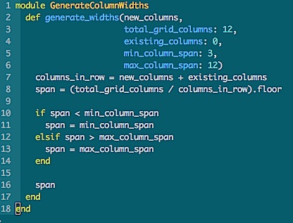
So, I made a module, and refactored the heck out of the code – resulting in what you see above. Instead of more than 30 lines of eeeek!, it’s now 18 lines that you can actually read:

https://github.com/liantics/gph/blob/master/lib/generate_column_widths.rb

Here’s How it Works:

In Bootstrap 3, columns are arranged in rows. Each row has a certain maximum number of columns in it. The default is 12.

The columns in a row can be divided into sections, using a “col-” css class that indicates how many of those 12 columns you want to use for each section of content within the row.

The css class also indicates the smallest screen size on which to apply that class. Any device with a screen below that size will default to using all 12. Everything above that size will use the number you specify. (You can specify for multiple sizes, too, but I’ll leave that to the bootstrap docs).

So, if you want your 12 columns divided evenly into 4 sections, you’d use a span of “3”: which means you want each section take up 3 of the 12 columns. Dividing the 12 columns by the span indicates how many sections you’ll end up with. In this case, 12 / 3 = 4, so the row will be divided into 4 sections.

In your html, the css class to make 4 even columns for all screen sizes, from size small (tablet) on up, would look like this:

col-sm-3

col” = define a column span
sm” = define the screen size at which to start using this span
3” = the number of columns to use for this section.

In a div on your page, it would look like:

<div class="col_sm_3">

So far, so good!

What To Do About Empty Columns?

But what if you won’t know how many columns you’re going to need until you do some other calculation (like in my case, I have no idea if there will be any projects in a given meta-category), and you don’t want to display any empty columns?

The Default Solution is Ugly

The default solution is to pick the maximum number of columns, programmatically don’t show any columns that are empty, and do some css magic to align things. But I don’t like that, because you end up with clumps of unnecessary css alignment divs all over your code. I hate having to add a bunch of nested divs in order to make things align.

What If the Server Could Do It?

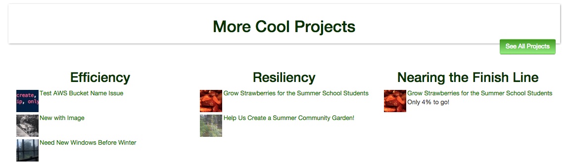
I thought what if, instead, the server could figure that stuff out all on its own, and automatically re-size columns based on what’s needed in a given spot at a given time. Even more important, on one page, I needed an extra column of data to co-exist alongside the meta-categories.

So the problem is even bigger than not knowing how many columns I’m going to have, but not necessarily knowing how many I need them to fit alongside. In the case of the home page, from the user’s perspective, the extra column (“projects near the finish line”) is just another meta-category for projects, but from the system’s perspective, it’s something completely different, calculated separately based on the number of donations a project has received, and it needs to fit nicely with the auto-generated category columns.

What I wanted to be able to do from the controller was generate the column span value, based on:

  • The number of new columns I was adding to the view
  • The number of columns that the new columns would have to share space with
  • The minimum span size (the number to divide into the total number of columns)
  • The maximum span size (essentially, this is what to do if there’s only one column)
  • The total number of columns available – in case I decided to use a grid that wasn’t 12 columns wide in the future. I’ve used 9 in the past.

From a code perspective, in the controller, this is roughly what I needed to be able to specify:

@column_span = generate_a_span(
  number_of_new_columns,
  total_columns_in_row,
  number_of_existing_columns_if_any,
  minimum_span_size,
  maximum_span_size
)

And in the view, I’d use something like:

<div class="col-sm-<%= @column_span %>">

But …

Specifying All Those Vars Every Time Would Be Annoying

I didn’t want to have to specify every single variable every time. Most of the time, everything but the number of new columns would be entirely optional, because I’d want 4 columns on most pages, and I’m not likely to change the grid size willy-nilly. This meant making all but one variable optional, and defining defaults for the rest.

The result:

def generate_widths(new_columns,
  total_grid_columns: 12,
  existing_columns: 0,
  min_column_span: 3,
  max_column_span: 12
)

In my controller for the home page, I have:

@column_width = Category.new.generate_widths(
  @category_types_count, existing_columns: 1
)

This handles the new columns I’m creating based on the number of category types in use (@category_types_count) as well as the one existing column generated from another source (existing_columns: 1).

Since I’m using the defaults for total grid columns, the minimum column span, and the maximum column span, I don’t have to specify those.

In my controller for the categories display page for admins, I have:

@column_width = Category.new.generate_widths(@category_types.count)

Since I don’t have to accommodate columns generated by other sources, I need only specify the number of new columns I’m adding, thus I can skip the “existing_columns” specification.

In both views, I have:

<div class="col-sm-<%= @column_width %>">

That’s it.

All I had to do was include the module in my category model.

Extra Cool

The extra cool thing: this can be used for any grid system that uses a numeric value in the css class strings in the view.

Auto-Generated Columns of Auto-Generated-Bootstrap-Column-Widths

screen shot of columns listing projects

Well that was fun!

Today’s task was to programmatically generate a set of columns of projects. Easy!

Then I decided that if a column didn’t have any projects in it, it shouldn’t display. OK, that took a little more work.

BUT that meant that the remaining columns would shift left, because of the way the bootstrap column layouts work, so, for example, if there were only 3 columns, in the 4 column wide layout, there’d be a big blank spot to the right, which was awkward. The whole point to a responsive layout is for things to align nicely, regardless of page width.

Soooo … I coded a means to determine how many columns the bootstrap css should display based on the total number of columns generated, relative to the max columns in the view.

And the result is what you see above!

Women Who Code Hack Night

screen cap of user avatar and user name

Great night at WWC Hack Night at Vista Higher Learning this evening! I got to meet a very enthusiastic young woman, and chat a bit about the project she’s involved with – the one that got her interested in learning to program. It was great fun to experience so much enthusiasm. I spent a bit of time showing her some basics – html, css, ruby: not enough to be scary (I hope!), but enough to make it so she might have a better understanding of the purposes of the different elements.

My (tiny) bit of work on GPH at the event: add the project owner’s name and avatar to the project page (see the image at the top of this story).

Notes from Engineers 4 Engineers Conference @ Constant Contact, today

I had a fantastic opportunity to spend the day at Constant Contact in Waltham, where they hosted the Engineers4Engineers Conference. I’ve been to a number of conferences over the years, and generally, the presentations are somewhat hit-or-miss. This one was all “hits.” I’m really glad I got the chance to go, even though it meant sitting through the mass of traffic on rte 128, leading to the intersection with rte 93 (on the plus side, the slow traffic resulted an in average 63 mpg for the trip, so I can’t complain).

All notes were taken on my cell, apologies for terseness and odd spellings! Also, this means quotes are *paraphrased*. Please don’t blame the presenters!

Laziness in Responsive Design

Ethan Marcotte

(*didn’t have the phone on for the first part of this – basic upshot: you can (and should) create a responsive site, if you’re willing to be the right kind of lazy about it. Let your content dictate the layout, not the other way around.)

Trick one – create a ratio-aware box: padding top 56.25% in CSS. Position relative.
Put your image box inside this w/an absolute position. The magic of css will take care of resizing the image.

Target divided by context = result.
In practice, this means: Element pixel width divided by container width

Use the :nth child layout.
Doc cell :nth-child(2n){your style} allows addressing every 2nd element.

Media queries: min-width nth child … By resolution in CSS

Current frameworks are HEAVY.
They require a lot of extra work, in your html, just to make the page draw nicely.

Right now, the web is in a similar place to the animation industry in the 1930s. When Disney studios started, they created an animation design framework that was lightweight, and worked well to describe and ensure every character’s animation quality, regardless of the story. We need similar for the web design.
See “The illusion of life.” Bio of Disney.

What’s needed in a new framework:
Content-out-layout
Light-weight. Brings the layout out of the HTML and into the CSS where it belongs.
How can we make the content feel at home regardless of screen size?

Use @media to *defend* your content, not to define it.

It should be device agnostic
Layout is only first step.


Initiation to Code: A Roadmap for New Developers and Their Mentors

Alice Mottola

Why hire juniors?

Junior devs are good for your team – making your devs learn to communicate and clarify.

22% job growth for sw engineers, but the stats for posted jobs are skewed highly toward senior not junior devs. But junior devs can’t become the senior devs to fill that growth unless someone hires them. Continue reading “Notes from Engineers 4 Engineers Conference @ Constant Contact, today”

Not Ruby-Related, but If You Ever Wanted to Geek Out Over Basement Heat Loss Calculations

Insulating your basement, while a bit lower down on the ladder of efficiency measure effectiveness, is still something to consider if you live in a cold climate and the basement is used as a living space.

http://www.nesea.org/uncategorized/heat-loss-to-the-ground-part-2/

Let’s assume the temperature below the slab is 50˚F and the average temperature against the foundation wall is 35˚F. Our basement is 24 ft x 36 ft. Doing the math, we get a heat loss of 2,161 BTU/hr

There’s a lot more in the full article.

Skip to content